Search
Read the original Bootstrap documentation on modals here.
Overview
The modal block allows you to add dialogs to your page. On page load modals are hidden then they can be toggled using links and buttons. When adding the modal block you gain access to additional blocks: Modal Header, Modal Body and Modal Footer. Each of these blocks are detailed on this page.
Toggle ModalHow it works
In order to get the modal block to function there are a few steps you need to take:
- Add the modal block to your page
- Add any content you wish to be included in the modal
- IMPORTANT: You must add a HTML anchor (id attribute) to the modal – HTML Anchor option is found under the Advanced section
- To toggle the modal add either a text link or a button to the page (not inside the modal)
- Update the link to go to the HTML anchor of the modal with a leading #
An example of this would be to add the HTML anchor attribute to the modal of my-modal you would then need to add a link or button that links to #my-modal. The rest will be taken care of for you.
The modal block has the following options:
Settings
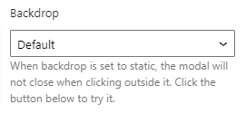
Backdrop
The backdrop option allows you to control how the backdrop functions. There are two options available:
- Default: A user can click the backdrop to close the modal
- Static: When a user clicks the backdrop the modal will not close.
Scrollable dialog
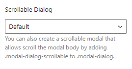
The scrollable dialog option allows you to control whether or not the modal body content is scrollable or not. There are two options available:
- Default: The modal body will extend to display the content
- Scrollable: The modal body will add a scroll bar to scroll the content
Vertically centered dialog
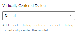
The vertically center dialog option allows you to control the position of the dialog. There are two options available:
- Default: The dialog will appear towards the top of the page
- Centered: The
.modal-dialog-centeredclass will be added and the dialog will be centred in the middle of the page
Reset Settings
Blocks tend to have a large number of settings along with different settings for each device size. You may get to the point where you have changed lots of settings and want to revert them back to the default. This can be time consuming and difficult to remember which settings have been changed to we have supplied three buttons that make this a piece of cake. Simply click the relevant button to reset your settings.
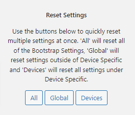
- All: When you click this button is will reset all of the settings for the selected block
- Global: When you click this button it will reset all of the settings outside of the device specific tabs
- Devices: When you click this button it will reset all of the settings within the Device Specific tabs
Advanced
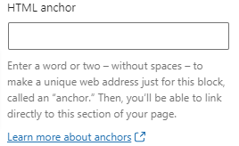
HTML Anchor
The HTML anchor option allows you to set an ID on the current block. This is useful when you wish to link to a specific area on a page.
Additional CSS class(es)
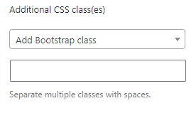
The additional class(es) option lets you add any other classes to the block. This is really useful as it allows you to utilise all of the Bootstrap utility classes to quickly apply styles and add more advanced customisations. A few examples of this would be to align all inner content by adding the text-start, text-center or text-end classes. You also have the ability to quickly search all of the available Bootstrap classes. To search Bootstrap classes open the Add Bootstrap class select box. You can filter the results by typing in the available search field. When you select an option it will automatically be added to your class list.

Modal header
Settings
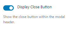
Display close button
The display close button lets you control whether or not the close button should be dispalyed in the header. If checked the button will display.
Reset Settings
Blocks tend to have a large number of settings along with different settings for each device size. You may get to the point where you have changed lots of settings and want to revert them back to the default. This can be time consuming and difficult to remember which settings have been changed to we have supplied three buttons that make this a piece of cake. Simply click the relevant button to reset your settings.

- All: When you click this button is will reset all of the settings for the selected block
- Global: When you click this button it will reset all of the settings outside of the device specific tabs
- Devices: When you click this button it will reset all of the settings within the Device Specific tabs
Advanced
HTML Anchor
The HTML anchor option allows you to set an ID on the current block. This is useful when you wish to link to a specific area on a page.

Additional CSS class(es)
The additional class(es) option lets you add any other classes to the block. This is really useful as it allows you to utilise all of the Bootstrap utility classes to quickly apply styles and add more advanced customisations. A few examples of this would be to align all inner content by adding the text-start, text-center or text-end classes. You also have the ability to quickly search all of the available Bootstrap classes. To search Bootstrap classes open the Add Bootstrap class select box. You can filter the results by typing in the available search field. When you select an option it will automatically be added to your class list.

Modal body
Reset Settings
Blocks tend to have a large number of settings along with different settings for each device size. You may get to the point where you have changed lots of settings and want to revert them back to the default. This can be time consuming and difficult to remember which settings have been changed to we have supplied three buttons that make this a piece of cake. Simply click the relevant button to reset your settings.

- All: When you click this button is will reset all of the settings for the selected block
- Global: When you click this button it will reset all of the settings outside of the device specific tabs
- Devices: When you click this button it will reset all of the settings within the Device Specific tabs
Advanced
HTML Anchor
The HTML anchor option allows you to set an ID on the current block. This is useful when you wish to link to a specific area on a page.

Additional CSS class(es)
The additional class(es) option lets you add any other classes to the block. This is really useful as it allows you to utilise all of the Bootstrap utility classes to quickly apply styles and add more advanced customisations. A few examples of this would be to align all inner content by adding the text-start, text-center or text-end classes. You also have the ability to quickly search all of the available Bootstrap classes. To search Bootstrap classes open the Add Bootstrap class select box. You can filter the results by typing in the available search field. When you select an option it will automatically be added to your class list.

Modal footer
Reset Settings
Blocks tend to have a large number of settings along with different settings for each device size. You may get to the point where you have changed lots of settings and want to revert them back to the default. This can be time consuming and difficult to remember which settings have been changed to we have supplied three buttons that make this a piece of cake. Simply click the relevant button to reset your settings.

- All: When you click this button is will reset all of the settings for the selected block
- Global: When you click this button it will reset all of the settings outside of the device specific tabs
- Devices: When you click this button it will reset all of the settings within the Device Specific tabs
Advanced
HTML Anchor
The HTML anchor option allows you to set an ID on the current block. This is useful when you wish to link to a specific area on a page.

Additional CSS class(es)
The additional class(es) option lets you add any other classes to the block. This is really useful as it allows you to utilise all of the Bootstrap utility classes to quickly apply styles and add more advanced customisations. A few examples of this would be to align all inner content by adding the text-start, text-center or text-end classes. You also have the ability to quickly search all of the available Bootstrap classes. To search Bootstrap classes open the Add Bootstrap class select box. You can filter the results by typing in the available search field. When you select an option it will automatically be added to your class list.
